

The main principle of deployment can be expressed in one sentence: ‘Map the crime and put the cops where the dots are.’ Or more succinctly: ‘Put cops on dots.’
Jack Maple, creator of CompStat, in his 1999 autobiography, The Crime Fighter: How You Can Make Your Community Crime-Free
The maps made crime clusters visual. It was like computerized fishing; you’d go where the blues were running.
William Bratton, former NYPD commissioner, in his 1998 autobiography, Turnaround: How America’s Top Cop Reversed the Crime Epidemic
♦♦♦
In 1996, the Harvard Kennedy School invited New York Police Department representative Louis Anemone to present the NYPD’s new management tool, a piece of software known as CompStat. The pioneering computer program had already been named a finalist for that year’s Innovations in American Government Awards. Anemone began his presentation by invoking the now-familiar language of the data “revolution:”
“CompStat—what is it? It’s revolutionizing the way that the NYPD polices the city of New York. At its most basic, it’s timely computerized crime statistical information coupled with a pin mapping ability also. It enables us in the PD to see crime trends as they happen on a more timely basis and to then implement crime fighting strategies throughout the city. But it’s much more than that. It’s a shot of adrenaline to the organization of the NYPD, right to the heart.”
CompStat would go on to win the Kennedy School’s Innovations in American Government Award, foreshadowing the tool’s influence in the decades to come.
Just a few years earlier, NYPD transit police detective Jack Maple had created a physical wall of maps, literally pinpointing crimes across the city in order to identify trends. Maple’s efforts built upon a tradition of crime mapping in policing that dates back to at least the 1850s. Maple’s “Charts of the Future,” as he called them, would catch the eye of transit police chief William Bratton, who would rise through the ranks to become New York City Police Commissioner in 1994. He would then appoint Maple a deputy commissioner. Maple’s system evolved from physical maps to computerized mapping software that same year,1 giving CompStat its name: Maple himself described it as an abbreviation of “Computer Statistics” or “Comparative Statistics.”2 (It should be noted that this is contested, and other stories about the origins of the name have been reported).
Championing a data-driven approach to policing, Bratton and Maple would operationalize CompStat across the NYPD. Together, they began holding twice-weekly CompStat meetings, where precinct commanders would engage in what we would now call data analysis, reading maps and interpreting charts in order to explain crime trends in their precincts.3 Between 1993 and 1995, New York City experienced a 27% drop in crime, and a 39% drop in murders, for which CompStat would be given significant—and undue—credit. (It’s difficult to isolate causal variables at play in that social shift. The drop in crime rate has been variously correlated with demographic changes, bans on leaded paint and gasoline, aggressive policing tactics, and much more—listed here are no fewer than 16 potential factors.)
“Even to the most innovation-weary criminologist, Comstat represented a revolution in policing,” described David Remnick in a 1997 New Yorker profile of Maple. In the ensuing years, prominent figures ranging from C.I.A. Director George Tenet to Vice President Al Gore would sit in on NYPD CompStat meetings. “Last month, I saw 21st-century crime-fighting technology at work at police headquarters in New York City. There the CompStat computer system fosters accountability by letting police track down crime… so they can get resources there effectively in real-time,” remarked Gore at a 1998 event on crime technology. “If we’re going to fight the criminals of the future, we need to develop the crime-fighting tools of the future. We must put the best possible tools in the hands of our law enforcement community so they can identify, apprehend, and prosecute criminals—swiftly and effectively.”
CompStat would spread like wildfire throughout police departments across the country; one Police Foundation report would go so far as to describe it as “literally burst[ing] onto the American police scene.” According to a National Institute of Justice-funded report, 60% of all police departments with a hundred or more officers “already had or intended to develop within a year a Compstat-like program” by 2001.4
Twenty-three years later, CompStat remains core infrastructure within police departments as both software and a tool for management. Cities from Hartford to San Francisco rely on CompStat for crime analytics, and many departments hold regular CompStat meetings. Officers are often required to hit quotas of arrest numbers, and “top brass” are evaluated based on CompStat statistics.
I myself first learned of CompStat from The Wire. “The Commissioner is attempting to move this department into the 21st century. That means preventing crime by relying on computer-generated data,” proclaims the fictional Baltimore Police Department Deputy Commissioner of Operations Bill Rawls, in a “ComStat” meeting. The tool is frequently referenced on the Fox comedy Brooklyn Nine-Nine. The CBS police procedural East New York aired an episode last year entitled, “CompStat Interruptus.” And in perhaps the most direct example, the four-season CBS drama The District was co-created by Jack Maple and based on his life. That a data-driven management tool has been so infused into our cultural vernacular speaks to CompStat’s pervasive influence.
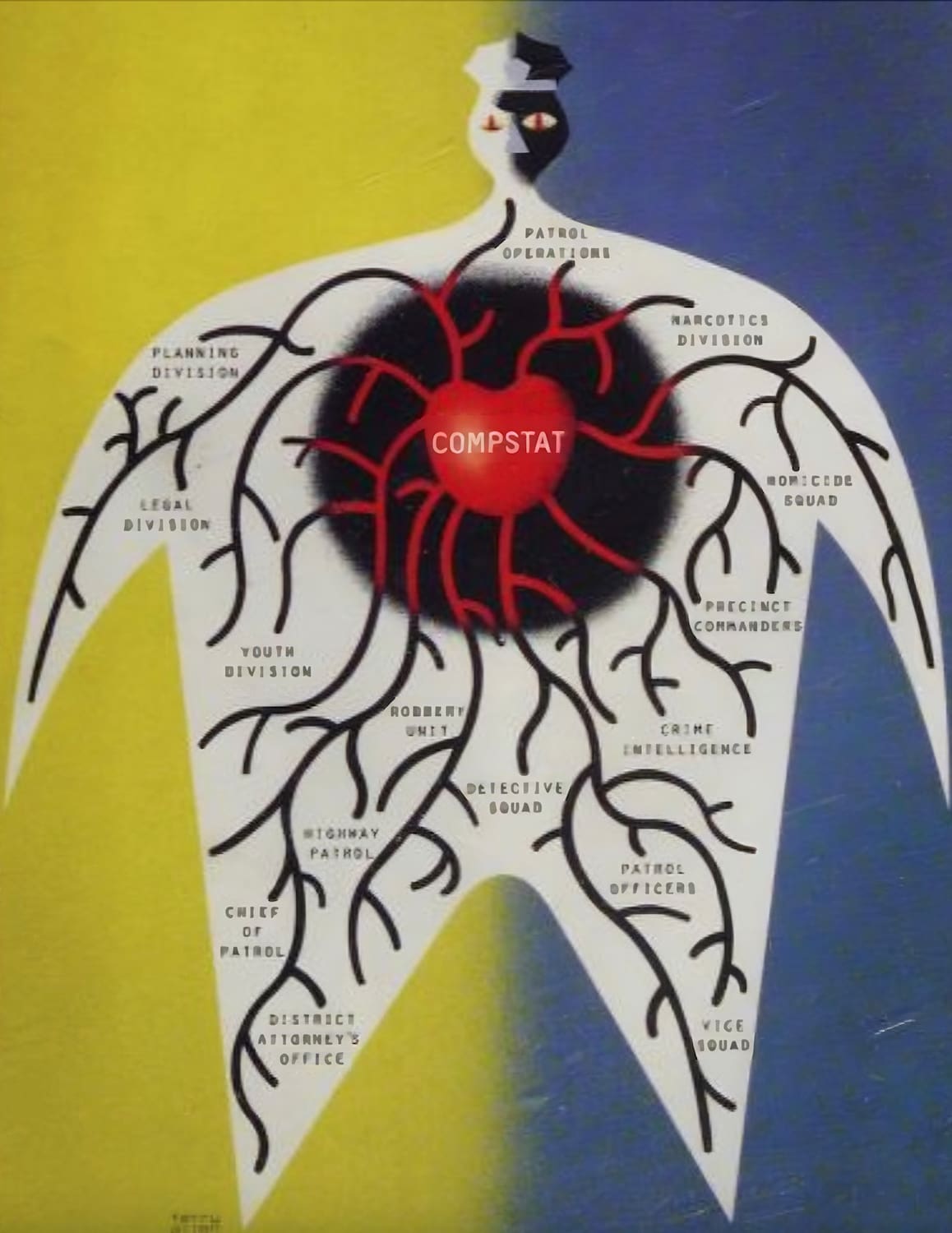
CompStat, with its aestheticized infographics and quantification of urban social metrics, has shaped police forces over the past thirty years in a significant way. As an abstracted representation mediating between the police and the people, it relies on a deep reductionism, quantifying crime and communities as numerical problems to be solved. With CompStat, the usual promise of the emancipatory power of data is turned on its head: supposedly intended to make our lives safer, its crime data is instead weaponized as a tool of the police, used to justify policing’s very existence through statistics and efficiency measures.
Along with the development of “mobile data terminals” in squad cars, predictive policing practices, increasingly sophisticated surveillance tools, and partnerships between police departments and tech companies such as Palantir, CompStat is a driving force in the reframing of policing as data analysis in both theory and practice. If CompStat is a prominent site of datafication, a place where humans and crimes become dots on a screen to be monitored and scrutinized by police, perhaps it is worth unpacking what it means when policing consists, as Jack Maple himself euphemistically described it, of “[making] the dots go away.”5
For the first time, crime maps were accompanied by bar graphs, pie charts, and trend lines, showing the days of the week and the times of day in which crimes were concentrated.6
Lawrence W. Sherman, Crime: Public Policies for Crime Control
A powerful software tool, MapInfo 94, became NYPD’s crime radar screen, with attention-grabbing colors and shapes. Red dots indicated drug complaints from the public, blue dots showed drug arrests, green triangles represented shooting incidents, and yellow dots indicated homicides. When projected on the war room’s large overhead screen and on small individual screens, the overlays of colors superimposed on street locations were impressive.7
Eli B. Silverman, NYPD Battles Crime: Innovative Strategies in Policing
Visualization techniques, borrowed from other fields and from those tailored specifically for crime data, are likely to become increasingly important, particularly as the complexity of the information conveyed to both analysts and superiors increases. Pictorial and symbolic representations, perhaps even animation, may aid in interpreting, understanding, and presenting results.8
Philip G. McGuire, Analyzing Crime Patterns: Frontiers of Practice
♦
What do present-day implementations of CompStat look like? Stripped of its context, the publicly available NYPD CompStat 2.0 interface resembles a canonical analytics dashboard, drawing the viewer in with its color palette, descriptive charts, and interactive map. It is only upon closer inspection that one comes to understand that crime statistics are being represented.
The left-hand panel of the CompStat 2.0 interface displays tabular data breaking down crimes—murder, rape, robbery, felony assault—by type and recency. Selecting a crime statistic dynamically surfaces blue dots on the map, showing where such crimes have taken place, along with a bar chart showing the crime’s frequency by day of the week and a line chart showing the incidence of the crime over time. These graphs can be further modified to reflect patrol borough and crime subtype, to adjust timeframes, and to change data plot types. If not for the nature of the underlying data, the webpage could just as easily be an interface for tracking sales or monitoring logistics. Indeed, from New York City to suburban Glastonbury, CT, police invoke the phrase “dashboard” when referring to their crime reporting interfaces.
Just as white-collar workplaces have come to employ now-ubiquitous visualization practices through the use of software like Microsoft Excel and Tableau, the police station has been subject to the same trend via the adoption of CompStat. And yet to describe CompStat as a separate and novel police analogue of corporate-style data interfaces would be to miss the explicit overlap between white-collar enterprise software and policing interfaces. As just one example, the NYPD’s current CompStat-adjacent Force Dashboard has been implemented using PowerBI, Microsoft’s interactive data visualization software for business intelligence. As described by Ingid Burrington, “the technical foundation of CompStat also emerged from retrofitting private sector tools,” dating back to MapInfo 94, Informix’s SmartWare, and Microsoft’s Visual FoxPro.9 That these interfaces evoke corporate dashboards is a direct consequence of the fact that they are often derived from the same enterprise products, with crimes graphically rendered the same way as click-through rates or revenue.
Rather than an interactive dashboard, the Salt Lake City Police Department’s weekly CompStat report for the Rio Grande district is a static .pdf, presumably derived from Microsoft Excel; nevertheless, it surfaces similar graphical representations to NYPD’s CompStat 2.0 interface, with line and bar charts showing the rise and fall of crime rates across time. The circular logic of CompStat is captured by these graphical undulations. If crime rates rise, then more policing is necessary, but if crime rates fall, then policing is effective. In the end, the joke is on us: despite prioritizing data and analysis in order to evaluate performance, CompStat can be used to justify policing, regardless of what it reveals.
Central to the Salt Lake City Police Department CompStat report’s visual display is a multicolor table, showing percent changes across time for various violent and property crimes, with decreases highlighted in green and increases highlighted in red. The Wilmington Police Department’s weekly CompStat .pdf report relies upon the same table structure, with the very same visual elements. The green and red, the tabular formats, and the percentage fluctuations in both reports recall the visual presentation of the stock ticker synonymous with the stock exchange trading floor.
Speaking for myself, I find there is something particularly unsettling about seeing violent crimes—forcible rape, criminal homicide, hate crimes—abstracted to the point of resembling securities or commodities. There is a jarring conflict between the sleek aesthetics of the charts and the gravity of what is represented by them, making it difficult to reconcile the conventional framing of infographics as “beautiful evidence,” in the words of data visualization pioneer Edward Tufte.
And yet, this abstraction seems to be an essential function of CompStat, which gamifies policing by design. This is underscored by the language used by the CompStat creators themselves, from Maple’s mandate to “make the dots go away” to Bratton’s CompStat analogy with “computerized fishing.” In his autobiography, Bratton goes so far as to say that as “the mapping progressed, and the intelligence progressed,” the NYPD had, “as we used to say, raised the level of Nintendo.”[10] This explicit rhetorical positioning of CompStat as a video game suggests a conceptual simplification of policing, where surveillance and violence are obscured behind the pixelated facade of “leveling up.”
A slide from “CompStat: Policing in Los Angeles” by Detective Jeff Godown, Officer-In-Charge, Los Angeles Police Department, showing aestheticized charts and graphs surrounding violent crime.
Here, resonances with the development of military technologies such as remote drone operation are clear, where abstraction and gamification serve to distance and insulate violence, not just for the operators themselves but for those both directly and indirectly responsible for calling the drone strikes (Samuel Moyn’s book Humane: How the United States Abandoned Peace and Reinvented War provides an excellent overview and draws out the connections between modern warfare and policing through this lens.)
Resonances can also be found in the visualizations and infographics that adorn slide decks produced and shared throughout the armed forces, as evidenced by a quick look through the Internet Archive’s “Military Industrial Powerpoint Complex” collection. In his essay, “Amazing Military Infographics: An Appreciation,” Paul Ford concludes his tour through unclassified .mil-domain military .pdfs—filled with organizational charts, maps covered with clip art, and other seemingly whimsical and Technicolor PowerPoint designs—with an important observation: “Part of what makes military diagrams so fascinating is that they look a lot like the images civilians use to do their regular workday jobs… there is a foundational fact that applies to each image: no matter how abstract they are, these pictures describe systems that the U.S. military uses to make optimal, efficient decisions about killing other humans.”
Something similar can be said about CompStat. No matter how mundane the software seems, and no matter how colorful its presentation, CompStat’s visualizations are instruments of the police. Their mundane quality is not just intentional but is rather essential in rationalizing and laundering violence and surveillance, too often racially motivated.
One does not need to look far in order to find clear links between these technologies and everyday data visualization applications ingratiated into our lives. For example, the visualization technology that would become CNN’s famed “Magic Wall”—seen periodically by millions during election coverage and bearing many similarities to CompStat interfaces, most prominently, demographic maps—was discovered by CNN executive David Bohrman in 2007 while walking the floor of a military trade show. (Borhman remarked that the wall “stopped me in my tracks. Once you see it, you get it instantly.”).
The multi-touch collaboration wall, as it was originally called, is derived from the “knowledge wall” popularized “to foster shared situation awareness, permit continuous updating of the military situation and enhance the senior staff’s ability to interact with supporting information systems,”[11] and has since been utilized by agencies including the CIA. As argued by Matt Kirschenbaum in a recent Critical Inquiry article, even the sand table—a visualization device long utilized in military planning and strategy—has influenced the rise of the digital computer and augmented reality interfaces. (One example title from a Military Review article: “Understanding Information as a Weapon: The Virtual Reality/Sand Table Model of Information Conflict.”)
If CompStat seems familiar, it’s not just because it is implemented using the same enterprise software we encounter professionally; it’s also because the visualizations that underpin our collective understanding of consequential events, like elections, are descended from technologies tied to violence, power, and surveillance from their creation. Modern media literacy expects us to accept datafication and abstraction as natural consequences of rational analysis, but this line of reasoning is not without its traps.
Perhaps CompStat implicates not only police but ourselves: our willingness to accept numericized crime trends and aestheticized policing from above, and thus numbers and aesthetics writ large, ultimately alienate human factors within algorithmic black boxes. We could have explored forms of collective governance that do not sanitize and launder police violence through a system tantamount to sales metrics. Unfortunately, as befits the interests of capital, our world has for decades been readily embracing the opposite.
A photo of an NYPD CompStat meeting, showing a multicolor pie chart, line graph, and map.
The four principles of CompStat:12
· Timely and accurate information or intelligence
· Effective tactics
· Rapid deployment of resources
· Relentless follow-up
Compstat: Its Origins, Evolution, and Future in Law Enforcement Agencies, a report by the Bureau of Justice Assistance and the Police Executive Research Forum
Compstat’s primary goal is to make police organizations more rational and responsive to management’s direction.13
Compstat and Organizational Change in the Lowell Police Department
Measurement is the first step that leads to control and eventually to improvement. If you can’t measure something, you can’t understand it. If you can’t understand it, you can’t control it. If you can’t control it, you can’t improve it.
H. James Harrington, as quoted at the beginning of Part I of Law Enforcement Tech Guide for Creating Performance Measures That Work: A Guide to Executives and Managers, a U.S. Department of Justice-funded report
♦
Beyond its software underpinnings, CompStat’s primary innovation in the eyes of its acolytes is its management-driven approach to policing. From its inception, Jack Maple’s work with CompStat was motivated by an interest in improving productivity through metrics. As described in his autobiography, Maple was inspired by watching the managers at a bar he frequented use nightly revenue calculations to dynamically adjust their management strategies. From an organizational perspective, the NYPD was certainly suboptimal at the time: in 1994, before Bratton became commissioner, the NYPD’s crime statistics reports were persistently three to six months behind.14
To address this with CompStat, Maple and Bratton drew heavily from corporate consulting practices. As reported by Matt Stroud in Thin Blue Lie: The Failure of High-Tech Policing, “Bratton even brought in a management consultant, John Linder, to advise him on administrative matters and to market the NYPD’s accomplishments to the public. Under Bratton’s direction and Linder’s advice—and informed by this new corporate policing mentality—Maple took great pride in making the department’s command structure more efficient.”15 This emphasis on corporate practices is captured aptly by Ingrid Burrington, whose Urban Omnibus essay provides an excellent overview of how CompStat fits into broader NYPD information systems:
“The CompStat meeting format bears more relationship to a corporate board presentation with VPs delivering quarterly sales numbers, a fact noted early on by reporters. A 1994 New York Times article headlined ‘Boardroom Tactics Utilized in the War on Crime’ noted that Bratton often utilized ‘corporate metaphors.’ The Times reported, ‘We have a lot to learn from the private sector,’ he said. ‘We’re looking at the customer—the public—to see what his needs are. We’re looking at the product. Does it meet the customer’s needs. If not, we’re going to change the product and change the entity that creates the product. The profit I’m looking for is reduced crime, reduced fear.’”
After being forced out as commissioner by Rudy Guiliani, Bratton would become a security consultant, taking an extremely active role in spreading CompStat across the country, as well as the world.16
Significantly, the rise in managerial science has historically coincided with a fetishization of measurement for evaluation, and a concordant championing of visualization practices to make the numbers come to life. Dating back to the nascent days of Taylorist scientific management, Henry Gantt popularized the now widely-used “Gantt chart” for project timelines as a means of identifying and evaluating underproductive employees;17 in 1931, Bell Labs employee Walter Shewhart, creator of the field of statistical quality control, introduced the first control chart in his book Economic Control of Quality of Manufactured Product.18
It therefore comes as no surprise that CompStat’s emphasis on analytics and visualization is driven by management practices. Just as the visual interfaces of CompStat elicit euphemistic, gamified descriptions of policing, CompStat’s managerial principles are defined by an abstracted vocabulary centered around numbers. In “CompStat and the New Penology: A Paradigm Shift in Policing?” James J. Willis and Stephen D. Mastrofski note that “one of the most striking features of the new penology is the language it uses to conceptualize crime and responses to it. This discourse replaces ‘a moral or clinical description of the individual with an actuarial language of probabilistic calculations and statistical distributions applied to populations’ (Feeley and Simon 1992).”19 Here, too, surveillance and violence are obfuscated behind language.
Interestingly, none of the four central principles of CompStat invoke language directly related to crime or policing; rather, they are most legible as managerial platitudes. Just as CompStat’s visualizations might as well be taken from a corporate analytics dashboard, CompStat’s core tenets are indistinguishable from broader corporate best practices. The 2013 joint Bureau of Justice Assistance and Police Executive Research Forum report, Compstat: Its Origins, Evolution, and Future in Law Enforcement Agencies, repeats empty corporate rhetoric: Louis Anemone is quoted as describing how “Compstat releases the power of middle managers.”[20] Along with Bratton’s “corporate metaphors,” his framing of officers as middle management recasts the unique nefariousness of policing as just another white-collar job, a sort of linguistic insulation not unlike the visual insulation of “dots” in CompStat charts.
A diagram showing the San Francisco Police Department’s CompStat DataStore from the 2008 audit by the City of San Francisco’s Office of the Controller.
♦
In July of last year, New York City Mayor Eric Adams appointed Edward Caban as the NYPD’s 46th commissioner. Caban gave his first quarterly crime statistics briefing as acting commissioner. In an appearance on the radio program “Sid & Friends in the Morning,” Caban appealed to CompStat information in painting his vision of NYPD’s future: “We’re going to continue to build on our successes. Just look at what we’re doing in our city… Overall crime is down for the first time in years. Transit crime is down. Homicides are down. Shootings are down. Enforcement is up.” Almost 30 years after it was created, CompStat and broader data analytics not only endure as core parts of NYPD practice but continue to build momentum, with no signs of stopping.
Today, CompStat represents the convergence of two potent forces: the continued encroachment of technology and complex systems into policing—a lucrative venture that threatens civil liberties and consistently demonstrates real and violent harm to people—and the ever-present corporate evangelism and aesthetic glorification surrounding data and management practices. To see these two forces as enmeshed is to recognize the ways in which data and efficiency serve as tools for obfuscation, abstraction, and insulation, ultimately legitimizing and furthering police interests. Reciprocally, CompStat serves as an important reminder for ourselves: when we encounter infographics and data-driven analytics, we must look beyond the shapes and colors and ask in turn: what is being lost in the abstraction to “beautiful evidence,” and why?♦
A list of the sources cited in this article is viewable here as a .pdf.
